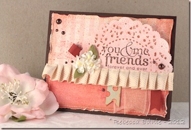
This card was for Feb week 4 of Viva la Verve Sketches. The ones they post at SCS. My kids spilled water on my computer so we had to let it dry out before I could post it here. I don’t know if you have to use Verve to qualify to win or if you can only win if you have played all 4 sketches but I liked the sketch so I played anyway. (ETA: yep, all 4)
I am really proud of this one. It’s been ages since I used my old stand by of pink and brown. Feels good to come back home! I have a few tips for you in achieving this shabby look.
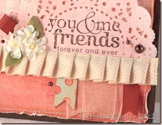
Tip 1: To get a beautiful distressed edge, add water before rolling, squishing and pressing the paper. It’s a softer look that just shredding the edge with a distresser or scissors or your nail. The opposite side of the paper will show which is a lovely, shabby look. I used a Q-tip and water with Perfect Pearls in it. Never pass up an excuse to add some pearlized water! but you can add some ink in it to colour the white edges if you wish, either to match your paper or a brown for distressing. If you want some torn sections, do that before or after because it won’t tear well while wet! See photo below for some close up areas.
Tip 2: Spritz with diluted colour mist using pearl water. Just a little bit gives it an aged, stained appearance. It can be subtle but really helps bring the card together. I used it on all the corners except the ribbon banner corner. Fill a Mini Mister by Ranger about 1/8 full with water and to 1/4 full with ink. Test and adjust until you like the intensity. You may need less darker inks and more lighter ink.
Tip 3: When you look at a sketch, think beyond your initial impression of what items should be used for a particular component. The horizontal element in this case was a scalloped strip. I could have gone with a scalloped punched paper strip or a scalloped edge ribbon which would have been even more interesting. But this ribbon treatment is miles above both of those IMHO. And if you immediately thought of ribbon for the banners, try thinking of ribbon next time. Or vice versa. What is even more interesting is combining them!!
Tip 4: Stamp on non-traditional surfaces and in layers. Stamping on the doily didn’t turn out perfect but that's what I wanted. The tips of a couple letters ended up on the holes and the texture isn’t perfect (part of the stamp too) but it looks vintagey! I also stamped the music on the striped paper which already had some texture on it from the manufacturer. If it hadn’t, I would have added some texture or script or something to it.
Tip 5: This isn’t specifically a shabby tip but a general tip. Cut apart or unmount that wheel stamp you never use! They are cheap and a great source of images. I now have 12 different words and 2 or 3 images! I wouldn’t have used that wheel hardly ever! (I bought it knowing I would cut it apart based on someone’s recommendation) The music image I used is also a wheel I unmounted. I leave it naked, no EZ Mount even, so I can apply it freehand which gives it a shabby or grunge look depending on how much ink I use and how dark the colour is.
Do you like the tips? The angled photo with props? These are also changes I’m considering trying out though it may seem slow to adopt as I use up some older photos. Let me know. Only though feedback can I make sure you get what YOU want out of this blog!
Enjoy, Rebecca
RECIPE
Stamps: music wheel, friendly words wheel-SU!
Ink: spray ink-Mr. Huey Boss Lady Studio Calico, chocolate-PTI, melon berry (stamped off)-PTI
Paper: chocolate CS-PTI, vintage typing paper for doily-stash, dp-MME
Accessories: perfect pearls-Ranger, pearls-Dollarama, flowers-stash, leaves-unknown silk cut smaller with rose creations die-Spellbinders, Doily die-PTI, ribbons-stash, sewing thread, foam dots-Jody Morrow, Scor-Tape, Ribbon-May Arts




No comments:
Post a Comment